Have you ever been in a situation where you’re hellbent on wanting to finish a deadline for a project, but it seems like no matter how many extra hours you put in, you just can’t reach that finish line?
We are sure that every employee just felt the prior statement to their core. One major thing that adds to the stress is when you can’t tell just how much work has been finished and how much more is on your plate.
It’s one thing to have an idea or a map of sorts that showcases the entirety of the project that needs execution, but it’s a whole other ball game when you also have a blueprint of the progress that you or your team has made.
This is exactly what a burn-up chart does. They help visualize how fast you’re moving forward and also, what could potentially be slowing you down.
If you’re totally clueless about burn-up charts, then this post is the perfect place for you to start learning! Here, we will discuss what burn-up charts are, why you need them, how they will change your work hustle, and how to create them!
Let’s get started, shall we?
What is a Burn-Up Chart? (Definition)
A burn-up chart visually represents how much work has been finished and the amount of work still ahead. It is really useful because it highlights the work completed along with the total project work.
It makes it easy for task or project managers to track the extent of the work done, which they can then compare to the total scope of work. By doing so, drafting up estimates on whether things are going as scheduled becomes a piece of cake.
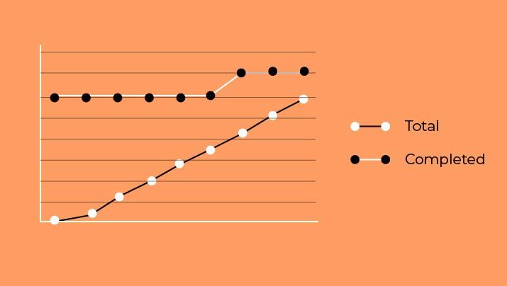
Burn-up charts are represented as graphs and the whole concept is not as ‘technical’ as you think. Basically, the amount of work that needs completion is shown as one straight line across the top of the graphs and a second line is used to simply track the work completed.
The details can be altered as per the project you are working on. Not only will a burn-up chart keep you updated on what is going on, but it will also help the entire team working on the project to be in tune with one another.
How to Read a Burn-Up Chart?
A burn-up chart may seem like this technical tool and maybe the graphs remind you of the mathematic papers you never really liked. But rest assured, reading and understanding a burn-up chart is not hard at all. Burn-up charts are not as complicated as they may seem.
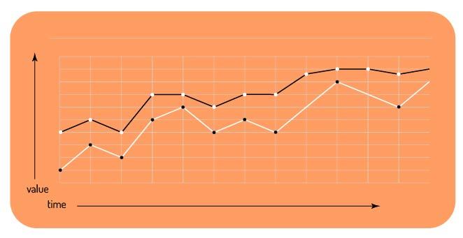 Basically, the vertical axis (the line that goes from the bottom to the top) represents the amount of work. It can be measured using different ways depending on your choice. It can be story points, estimates, and even issue count. The horizontal axis (the line that goes across) represents time in days.
To find out the remaining work, all you have to do is look at the distance between both lines on the burn-up chart. So, “Will the chart show when the work is completed?” is your question, then yes, when the two lines (horizontal and vertical) finally meet, the project is done.
Difference Between a Burn-up Chart and Burndown Chart.
If you’re reading up on burn-up charts, it’s handy to know what burn-down charts are as well. A burn-down chart showcases and illustrates the amount of work remaining on a project. In other words, the remaining effort still needs to be finished.
Contrary to a burn-down chart, a burn-up chart showcases how much work has been finished as well as the total scope of the project. Visually, the main difference is in the line of progress. In a burn-up chart, the line climbs upwards from the bottom. In a burn-down chart, the line progresses from the top to the bottom.
Both burn-up charts and burn-down charts are relatively easy to understand as they simply depict progress. But a burn-down chart may be even easier to read because it shows in most cases, only one line, while a burn-up chart is made up of more details.
Now that you have a little information on burn-up charts, it’s time to learn just how they can help you and your team.
How do Burn-Up Charts help with Project Management?
1. Monitors Effectiveness
With a visual representation that showcases the extent of work being executed as you go, you can easily monitor the effectiveness of your team. As every addition and completion is being tracked, project managers can quickly determine everyone’s performance and adjust accordingly to meet the required deadline.
2. Enables Predictions
Because progress rates can be tracked, burn-up charts help determine if projects will be finished on time. This may not seem like such a big deal, but in the grand scheme of things, being able to predict if the planned deadline can be met will enable project managers to adjust their teams accordingly if and when needed.
3. Highlights Differences
A burn-up chart will highlight differences in the execution of certain aspects of your project. Let’s say one small part of the project was finished in a set time, but it takes your team longer to finish another small part of the project with the same scope.
You can easily point out differences in performances such as this using a burn-up chart and tackle right away any potential issues that may be slowing down your team.
4. Promotes Proactiveness
A chart that monitors and showcases every aspect of the project that is being worked on, creates a productive work environment.
Being able to see performance levels inculcates in every team member a drive to want to do better. At the end of the day, burn-up charts by default promote proactiveness.
5. Sense of Security
If you’ve read through all the above points of benefits, it’s apparent that a burn-up chart basically tells you all of the requirements and objectives that are needed for the success of a project.
And so, it provides a sense of security not only to you and your team but also to clients and stakeholders as well, because it keeps them up to date about what exactly is going on.
Now that you know the several benefits of using a burn-up chart, let’s go over the steps involved in creating one!
How to Create a Burn-Up Chart? (A Step-by-Step Guide)
How people create burn-up charts can differ depending on the nature and scope of the project. Choose what works best for you but to make the right choice, we suggest you keep in mind the following tips:
Step 1. Map Out the Scope
Before starting any project, it’s crucial to identify the scope of your project. Defining the scope enables the project manager to map out a list of necessary tasks. This will provide clarity for everyone involved and will aid in avoiding the addition of useless or unnecessary features.

Once the crucial tasks are identified, these tasks will make up what is known as the ‘product backlog’ which can then be refined and further prioritized. Mapping out the scope is the first step to ensuring that the project is finished within the deadline.
Step 2. Propose Duration Estimates
Once the list of necessary tasks makes up the product backlog, you need to make an estimate of the duration of your project. It is probable that you may not adhere to each and every set timeline, but it is wise to propose an estimate.
Keep in mind that the same duration should be fixed for each ‘sprint’ in the burn-up chart. Also, it is the number of iterations present on the burn-up chart that showcases the total duration of the project.
Step 3. Divide the Workload
Estimating the time needed for each task requires you to assess the efforts needed to complete each task.
Doing so will help you have an idea of the total workload required to finish the project. Once that is complete, you can start dividing the work fairly between team members working on the project to achieve optimum results.
Read More: Workload Management: Definition, Importance, Process & Tools!
Step 4. Use Excel
Although you can use any agile project management tools of your liking, we recommend using excel especially if it’s your first time making a burn chart.
Excel has easily understandable features that make it easy to draft graphs for your burn-up chart. Also, it’s so much simpler to build a burn-up chart using the spreadsheet format.
Step 5. Set X and Y Axis
Now that you know what has to be kept in mind, it’s time to actually start building your burn-up chart. Basically, a burn-up chart is in a graph format. So, create the X- axis across the bottom of the chart. This will depict the ‘sprints’ or the time allotted for the project.
Likewise, create the Y- axis vertically across the chart. This depicts the ‘story points’ or the amount of work to complete. It really is just as simple as that. You can customize your burn-up chart by choosing a color for each line of the chart. Keep in mind that you should determine what each color represents.
Step 6. Monitor Changes
Now that your burn-up chart is completed, you can use it to monitor the changes and progress of your project in real-time.
This will keep the project manager updated and keep the entire project team accountable and productive. Once you’re well versed on how easy it is to build a burn-up chart and how effective it is, we can assure you that it will quickly be an essential tool used for your work endeavors.
Wrap Up
Burn-up charts are one of the most helpful tools to keep track of a project’s progress. It not only aids with the success of a project’s execution but also ensures that everything is done in accordance with the timeline.
Burn-up charts will add quality to your overall work because it is one of those tools that will boost productivity. So, start working on creating your burn-up chart today and see just how much it will come in handy. Good luck!
Further Reads:
- Project Baseline: What is it, Its Importance, & How to Set it?
- Project Management Schedule: What is it & How to Create it!
- Best Free Project Management Software: Complete List with Features!
- 11 Gantt Chart Software You Should Check Out!
- Project Management Guide with Free Template!