Looking to improve your social media presence? Let’s take a look at how you can create basic design elements for social media and their impact in improving your brand’s visibility online
Basic design elements photos make an impact from the moment they’re seen. They are able to stand out, grab people’s attention, and keep them mesmerized.
As you can imagine those are all qualities that you would want in the photos that you publish on social media. In fact, they are vital, especially seeing as most people skim over the content on their timeline at a breakneck pace.
By creating more basic design elements photos, you stand a better chance of them being seen and engaging more viewers. But that isn’t just going to magically happen, and to pull it off you need to know what makes photos look striking – and how to use that.
It may surprise you to know, but it really all boils down to using basic design elements in your photos.
Basic Design Elements In Photos
1. Lines
Lines are the most basic and yet most powerful design element and are at the core of striking photo composition. When you snap photos it is important that you look for and observe the lines around you – and consider how best to use them.
As you’ll notice lines can be found in a spectacular variety, both long and short, thick and thin, straight and curved, and much more. More importantly different types of lines can have very different emotional impacts and can be perceived in different ways.
Some of the types of lines that you can use to produce a more compelling composition include:
- Vertical lines can show power and strength, or growth and expansion.
- Horizontal lines that look stable, calm, and solid.
- Diagonal lines that seem to add tension and make photos more dynamic.
- Straight lines that look even, stable and rigid.
- Curved lines are soft, relaxing, and organic.
- Thin lines that seem vulnerable or fragile.
- Thick lines that appear to be powerful, stable and firm.
- Jagged lines that are forceful, sharp, and tense.
Make no mistake there are lots of other types of lines, but the list above should help you to get started. In some cases, the relationship between the lines in your photos and how you frame them can produce more unique effects.
For example, twin parallel lines photographed from a perspective that makes them converge in the distance is a popular way to give photos depth.
Read more: 19 Best Free Stock Photos Websites
2. Shape
It is easiest to think of shapes as the outline of objects in two dimensions. Photographing the right shapes can make your photos more visually interesting and create a composition that is strong and striking.
The shapes that you use can be geometric or organic, and they can be positive (i.e. the outline of objects) or negative (formed by the objects around them).

Regular and even shapes tend to look more stable, while irregular shapes are more dynamic. On the other hand, organic shapes can look more natural and relaxed.
To use the shape in your photos, you need to first identify appealing shapes and then find a way to frame them with the right perspective so that they contrast with the rest of the image.
That will help set the shape apart and draw more focus to it, allowing it to have more of an impact.
Some of the popular ways to use shapes are to photograph objects from overhead or shoot them as a silhouette.
3. Form
The form is very similar to shape – but in three dimensions instead of just two. Because of that, it can give your photos additional depth provided it is captured in a way that accentuates its three-dimensional nature.
The best way to showcase the additional dimension and depth of form is to use light and shadows to shade it. The way the form is lit and the manner in which it is shaded can emphasize its depth and make it seem to sink in or pop out of the photo.
Effectively capturing form in a photo will take some experimentation and you’ll want to try different angles and perspectives in relation to where the light is coming from. Lighting objects from the side or above can help reveal its edges and depth of the form.
In many cases, you’ll have a decision to make on whether you want your photos to focus on the form and its depth, or the shape created by the outline of the elements in it.
4. Color
Color can enable your photos to have a profound emotional impact. The exact manner in which people react to various colors can vary, but the fact that color has a psychological effect is undeniable.

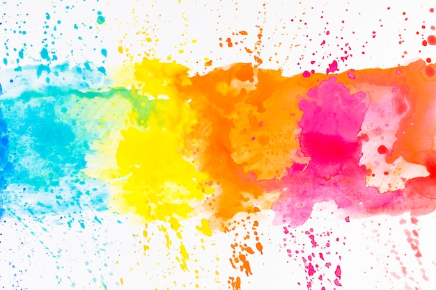
In general vivid colors have are bright and saturated attract the most attention, making them a key ingredient in basic design elements images. The more vibrant the color the more active and interesting your photos will look.
Aside from that, there are several emotional connections for various colors that are worth taking into account:
- Red is used to show power, warmth, defiance, and courage.
- Blue is calm, serene, trustworthy, and can even be cool or outright cold.
- Yellow is confident, optimistic, and friendly, but could be fragile or signify fear.
- Green is balanced, refreshing, serene and reassuring, but can signify envy.
- Violet is rich, mysterious, and wise.
- Brown is serious, strong, and earthy.
- White is simple, pure, and efficient, but can appear sterile.
- Black is elegant and sophisticated but can signify evil or unhappiness.
- Orange is warm, passionate and fun.
- Pink is nurturing, tranquil, and emotional.
On top of the emotional weight of colors however, there is one other aspect of them that makes them important to photos: Contrast.
The contrast between the hues of complementary colors will help important elements and areas of your photos stand out. When placed side by side, they will accentuate one another and create focal points that people are drawn to.
While you can’t determine the color of objects, you can choose to include or exclude objects of specific colors in your photos – and decide how to frame them. If necessary you can edit the colors in various ways during post-processing or even alter them completely.
Read more: Top 12 Design Collaboration Tools For Designers
5. Texture
Another element in your photos that can stir an emotional reaction is the texture that is in it. It can be tricky to find and photograph it in such a way as to bring it out, however.
The key to effectively photographing texture is the manner in which the light reveals it. Side or overhead lighting can be particularly useful in that regard to get into the edges of the texture and reveal its form with shading.
To showcase texture you will need to get close enough to capture its subtleties. However, texture can help to accentuate your photos in other ways as well and make backdrops more dynamic and alive.
If you want your photos to look more striking you should seek out textures and try to incorporate them in your photos. Some of the more popular types of textures include cracks, rough stones, wood, or sand and earth.
6. Patterns
Patterns are a function of color, texture, and shape – and can be found everywhere. Incorporating them in your photos can make them more visually interesting and give them a certain rhythm.

If you want to use patterns to create basic design elements photos, there are two useful options that you can consider:
- Emphasizing the pattern and filling the frame with it will give it a sense of scale. If the pattern itself is not regular, some parts may very naturally turn into focal points.
- Breaking the pattern by adding elements that contrast with it can help to set important elements apart. It is a useful way to create a very strong focal point around a specific element.
Developing a keen eye for patterns can be tricky, but as you start to take notice of them you’ll find that you have more ways to create striking photos.
Conclusion
The basic design elements listed above are the foundation that you need to create striking photos for social media. Based on them you can come up with more interesting compositions that attract and retain much more attention.
That being said there are other ways to help make photos more striking as well. For example, filling the frame with an element, using minimalism, or even employing negative space effectively can all contribute to how striking a photo appears to be.
One of the more common ‘tricks’ to make social media photos attract more attention is to add a strong caption. That can be done using tools available in the market, you can also go through elink.io’s “How to watermark photos” post for detailed instructions.
Suffice to say understanding the underlying principles behind basic design elements will equip you with what you need to use them. Each photo is unique, however, and it will be up to you to identify which elements you want to use in conjunction with one another.
At first, that may seem difficult, but it really just requires a bit of experience and you’ll find that it very quickly starts to become second nature as you capture and edit photos for social media.
Further reads:
- How To Embed Canva Designs Into Your Documents
- Design Brief: What is it & How to Create One that Works?
- How to Embed Behance Inspirations Into Your Documents
- How To Embed Figma Designs Inside Your Documents
- How To Embed Live Box Files Into Your Documents
- Design Documents: Definition, Importance, Key Elements!
[/vc_column_text]

