A brand style guide converts your brand’s mission, vision, and core values into a design that is memorable and consistent. Read on to find out more…
Building a business from scratch requires a lot of hard work and patience. Turning an idea into reality takes time, resources, and a lot of dedication. One thing, however, people often miss is maintaining consistent brand identity across their business.
When it comes to branding, consistency is key. Your brand is the face of your business, with identity online and in the real world. It’s like a virtual person with some core values, driven by its concrete mission and vision.
Making sure that this virtual identity is consistent requires strategy. But how do you ensure brand consistency when you have a number of different departments, stakeholders, or agencies producing your branded sales collateral?
Through a brand style guide!
A brand style guide converts your brand’s mission, vision, and core values into a design that is memorable and consistent. But how? Let’s find out.
What’s a Brand Style Guide?
A brand style guide is a document that defines how a company presents itself to the world. A brand style guide acts as a “guide” or a reference document for marketers, branding experts, designers, developers, and other stakeholders to help them maintain brand consistency by demonstrating what a brand looks, feels, and sounds like.
It is a rulebook containing specifications on everything that plays a role in the look and feel of your brand– from imagery, typography and color scheme to logos. It lets everyone involved with the company know exactly how to present their brand to their customers and prospects.
Read more: The Definitive Guide To Business One Pager (Template Included)
Why is a Brand Style Guide important?
Imagine browsing through a sneaker sale and recognizing the Nike sign. Or spotting your favorite brand of cereal miles away in a grocery store.
Why do you think we remember all these brand identities? It’s because of their consistent messaging, logo, and visual appeal. Wherever you go, whether you’re in a mall, surfing the internet, or driving on a highway, you can see the same Nike logo, the tick sign with the tagline “Just do it”.
When the brand successfully shows customers a homogenous identity, they end up being memorable. When your business is what a customer thinks about while looking for a product, you have a high chance of making a sale.
Companies need to make sure their brand is recognizable in every instance — be it in public, online, or print— to give itself a sense of credibility, familiarity, and stability. Why would a brand need to be recognizable you ask?
Well, ask yourself this- if you see someone change how they look, talk, and act all the time, you won’t feel like you know who they are, and you certainly wouldn’t trust them.

Only when you are certain about someone’s personality that you start trusting them or being friends with them. In the same way, by keeping your brand personality consistent, your prospects and clients will feel like they know you and can trust you in doing a transaction.
Inconsistency confuses your customers and steers them away from your brand. A style guide is thus critical as it helps your business communicate in a consistent way across all teams and marketing channels.
Key Components of a Brand Style Guide
Like every company, your brand’s assets like the logo, images, tagline, and other marketing material are developed by many people before it gets finalized and reaches the final audience.
You might have an in-house team of designers, marketers, web developers, etc. to brainstorm the logo design, color scheme, website design, online ads, or the catchy tagline, or you might hire external agencies to do the same.
Since multiple departments or teams are involved in the branding of your business and developing its unique image and voice, they need to follow the same set of guidelines to maintain brand uniformity.
A typical brand style guide has the following elements to make sure that your brand is consistent throughout its presence.
Element #1: Brand Story
Start your brand style guide with a nice brand story. For those of you who are unfamiliar with the term, a brand story is a simple summary of what your brand’s all about.
It communicates a key company values to the public along with its reason for existence (its mission statement). It can also include a brand’s target demographic, what problems it sets out to solve, and how the company wants to be perceived by its customers.
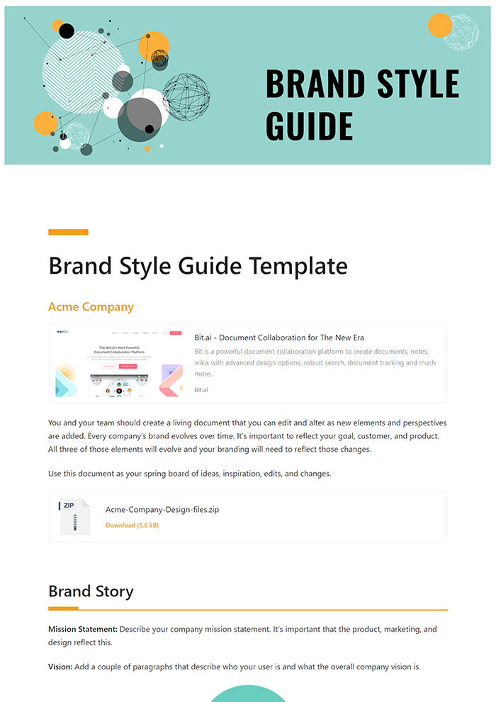
Mission Statement: Describe your company mission statement. It’s important that the product, marketing, and design reflect this.
Vision: Add a couple of paragraphs that describe who your user is and what the overall company vision is.
Brand stories are different for different companies, but every brand story combines its mission, vision and core values into a compelling story.
Check out Skype’s brand story for inspiration. The colorful, fun approach to their mission statement is engaging and conveys to the audience how it wants to be perceived as a friendly brand/company.
[/vc_column_text]

Element #2: Logo
Logo, being the brand’s identity, plays a crucial role in making your company a recognizable force. Define and give examples of your logo in your brand style guide. Below are the elements of the logo one must include in the brand style guide:
- Logo specifications
- Approved logo color variations
- Clear zone (the designated area around the logo that must be free of any other graphics or typography to ensure the logo’s integrity and readability)
- The minimum size of the logo and placement
- Alternate versions of the logo (ex: horizontal or vertical orientation)
- You should also provide logo files in different file formats like .png, .jpg, and vector-based formats.
Read more: How to Write an Effective Creative Brief
Element #3: Color Palette
Defining a brand color palette is imperative in creating a consistent look and feel. Including details for your color palette ensures design consistency across product, design and marketing departments. Be accurate in providing HEX and RBG color values for digital purposes to remove ambiguity.
Element #4: Typography
Fonts play a big role in any marketing or sales collateral you produce. Thus, its critical that you have a consistent font style, font family, font style, line spacing, typeface, etc. to maintain your professionalism. Make sure to indicate which font or type is to be used where to avoid confusion. In case you don’t know which font is used in certain sales or marketing collateral, you can take the help of tools to identify or find a font from an image.
Chosen fonts with heading sizes (establishing hierarchy):
- Headline Font Style
- Regular Font Style
- Caption Font Style
Element #5: Imagery
Images play a huge role in communicating with your audience.
Include examples of images in your brand style guide that have performed well for your brand. These can be images for print or for social media.
If it’s an early stage for your company, include images from other big brands you find inspirational to help give your team a sense of the style to align to.
Having a central location for all the kinds of visuals you need to use for your brand can come in handy when designing new marketing and sales materials.
Read more: 18 Sites For Free Stock Photos And Images
Element #6: Voice
Make sure to specify your brand’s voice to ensure consistent messaging across all marketing channels.
It’s also recommended that you add a list of adjectives that describe your brand’s personality (around 4-5 adjectives). Specify the writing tone and the kind of personality you want your brand to have.
Once you have your outline, decide if you want your guide to living as a digital document, be printed, or both. Make sure to keep updating this brand style guide according to any recent changes to your brand identity and keep all the stakeholders in the loop of these changes.
It’s important that your brand style guide is easy to find and written in clear and precise manner for everyone to understand.
🎥Watch this video to learn more👇
Bonus: Create a clear, consistent brand guide using this Brand Style Guide Template in Bit.ai.
Conclusion:
The best brands are those which stick in our brains. The ability of a brand to become recognizable is defined by the repetition of the same images, logo, tagline, fonts, and colors.
Once we are exposed to them for a consistent amount of time, they become instantly recognizable, making them trustworthy and reliable.
All of this happens when the company makes proper use of a brand style guide to keep everyone on the same page. Always remember, your brand style guide is a living, breathing document.
Not everything you use for your branding and messaging is going to work, which is why it’s critical that you keep updating and revisiting this document periodically. But the first step is to create one and kickstart your branding process, the right way!
Bonus!
In need of a brand style guide? Don’t worry, we got you covered! We have put together a free brand style guide template for you, covering all the things you would need to create your own awesome brand style guide. So what are you waiting for? Click the button below and start creating your brand style guide today!
Further reads:


