Imagine receiving a business proposal written in Comic Sans. Would you take it seriously? Probably not. The fonts we use play a crucial role in how our work is perceived, whether it’s a resume, a company presentation, or a website.
Typography is more than just aesthetics – it directly impacts branding, readability, and professionalism. The right font choice can enhance credibility, while the wrong one can make even the most well-researched document look unpolished. Whether you’re designing marketing materials, drafting reports, or creating a standout resume, choosing the best font is essential.
In this guide, we’ll explore what makes a font professional, the best fonts for different use cases, and expert tips on font pairing!
What Exactly Makes a Font Professional?
Have you ever come across a document that just felt polished, structured, and easy to read? Chances are, the font played a huge role in that impression. A professional typeface isn’t just about looking nice – it’s about ensuring clarity, readability, and a modern appeal while maintaining a sense of authority. A well-chosen font enhances credibility, while a poor one can make even the most well-researched document look amateurish.
Whether you’re drafting a business report, designing a website, or crafting a proposal, the font choice you make impacts how your audience perceives your content. Here’s what defines a professional font and why it matters.
1. Clean, Modern, and Easy-to-Read Characteristics
Professional fonts are made with one main goal in mind: to be easy to read. That’s because your brain can understand text faster when it’s laid out in a clear and organized way. This is why the best professional fonts have clear letter shapes that don’t hurt the eyes and good spacing between them.
Imagine reading a business report with tiny, cramped letters or, worse, a font that is overly ornate and hard to decipher. It would take more effort to read, right? That’s exactly what you want to avoid. The ideal font size for body text is typically between 10–12 pt—small enough to fit a reasonable amount of content on a page but large enough to be easily legible.
Simple, clean, and modern fonts are great for business and professional settings because they don’t have any extraneous details. Because they are so simple, the attention stays on the text and not the design. This makes them perfect for documents that need to be clear.
2. Avoiding Overly Decorative or Outdated Styles
Just as fashion trends change over time, so do typeface preferences. Some fonts, while once popular, have fallen out of favor due to their outdated or overly stylized appearance.
Think of fonts like Papyrus, Comic Sans, or Curlz. While they may have their place in specific creative projects, they have no business in a professional setting. These overly decorative fonts can make a document look amateurish and even untrustworthy.
Similarly, while New Roman has long been a default font in professional settings, its overuse in academic papers and business reports has made it feel a bit stale. If you want to maintain a classic, polished look but want a fresh take, consider alternatives like Garamond or Georgia—both offer the same level of professionalism with a slightly more refined touch.
3. Font Consistency Across Platforms
Imagine working on the layout of a document for hours, only to send it to a coworker and have them open it with different spacing and alignment. It’s annoying, right? This is what happens when a font isn’t supported by all systems and devices.
Certain fonts, like New Roman, Arial, and Calibri, are set by the system and will always look right, no matter what program or device is being used. But if the recipient doesn’t have them installed, custom fonts or less popular typefaces might not work right. This can mess up the layout of the paper and make it look unprofessional.
For this reason, always choose widely supported fonts for important business documents. If you must use a custom font, consider sending your document as a PDF to preserve formatting, ensuring it looks the same regardless of the viewer’s device.
Choosing the right font isn’t just about what looks good—it’s about aligning your font choice with the tone and purpose of your message. If you’re writing a research paper, a classic serif font may be the best fit. But if you’re designing a sleek corporate website, a sans serif font will likely be the smarter choice.
4. Psychological Impact of Fonts!
The fonts used in a paper do more than just show the words; they also set the mood and affect how the information is understood. The moment someone looks at a text, they automatically form an opinion about it based on how it looks. Some fonts are trusted, reliable, and official, which is why they are often used in institutions, official papers, and academic writing. Their organized and familiar look makes them seem trustworthy and professional.
On the other hand, styles that are simpler and cleaner give off an air of modernity and friendliness. They show up a lot in branding, business presentations, and digital platforms that need to be easy to reach and talk to. Depending on how they’re designed, some fonts can even make you feel creative, elegant, or excited.
Because typography plays such a subtle yet significant role in communication, choosing the right style is essential for reinforcing the message and ensuring it resonates with the intended audience.
Best Professional Fonts for Different Use Cases
Choosing the right typeface isn’t just about aesthetics – it’s about setting the right tone, enhancing readability, and ensuring your message leaves a lasting impression. Whether you’re crafting a business report, fine-tuning your resume, designing marketing materials, or optimizing a website, your font choice plays a crucial role in how your content is perceived. Below are some of the best fonts for different professional settings, ensuring that every word looks as polished as it sounds.
Professional Fonts for Business Documents & Reports
When it comes to business writing, clarity isn’t just appreciated – it’s expected. But that doesn’t mean your documents have to look dull. The right typeface can add structure, confidence, and polish to everything from reports to corporate presentations. These fonts don’t shout for attention; they lead with subtlety and strength, making sure every data point and insight lands with clarity and credibility.
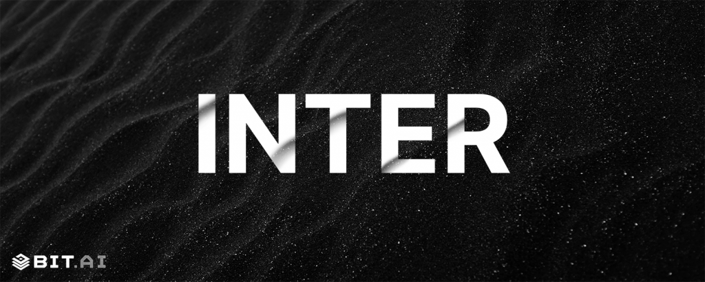
#1 Inter
Inter is that clean-cut professional who always turns in their work early, color-coded, and well-structured. Designed for digital interfaces but graceful on print, it balances high legibility with a modern sensibility. It’s neutral, but not bland – structured, but not stiff. A dependable choice for corporate settings.
#2 General Sans
Think of General Sans as the calm, composed consultant who listens more than they talk, but when they speak, everyone pays attention. It’s minimal, versatile, and subtle, with thoughtful spacing that makes long documents feel breezier. It doesn’t try to steal the show, it simply delivers, elegantly.

#3 Satoshi
Satoshi walks the line between modern minimalism and personality. It’s neutral but with just enough character in its curves and proportions to stand out in reports, business decks, or executive summaries. It’s perfect when you want a font that looks forward without shouting about it.

Professional Fonts for Resumes & Cover Letters
Your resume is more than a list, it’s a reflection of your professionalism, taste, and how seriously you take your craft. Fonts in this category are here to support your story. They’re clean, contemporary, and quietly impactful, striking that delicate balance between looking smart and sounding human. After all, when the right typeface meets the right experience, it’s more than just words on a page, it’s a first impression done right.
#1 Poppins
Poppins brings a geometric flair to the world of job applications. Round and approachable, yet sharp in presentation, it’s the font that says “I’m detail-oriented and personable.” Perfect for creative professionals or modern companies who appreciate a little design boldness with their resumes.

#2 Mulish
Mulish is gentle and unassuming, yet quietly polished. It doesn’t beg for attention, it earns it through soft curves and clear readability. It’s the ideal typeface for someone who wants their content to shine without dressing it up too much – simple, sleek, and sincere.

#3 Noto Sans
Noto Sans is the global citizen of fonts. Designed to harmonize multiple languages, it brings consistency and clarity to international job applications. It feels balanced, modern, and inclusive – ideal for companies that value diversity, global reach, and smooth communication.

Professional Fonts for Branding & Marketing Materials
Every brand has a voice, but great design gives it a visual identity. In marketing, your font choices carry as much personality as your colors or logo. The right typeface can flirt, charm, or command attention. These fonts are crafted for brands that want to leave a mark, bold when they need to be, refined when it counts, and always ready to tell a good story in style.
? Want polished marketing documents? Try Bit.ai’s marketing templates!
#1 Neue Montreal
Neue Montreal is the stylish minimalist who knows how to make a scene just by entering the room. With its Swiss-style influence and perfectly balanced geometry, it offers sophistication without stuffiness. Think of it for brands that want to feel premium, modern, and quietly cool.

#2 Recoleta
Recoleta has soul. Inspired by 1970s serif type, it’s bold, curvy, and full of character. Whether it’s used in a playful boutique identity or nostalgic packaging, Recoleta doesn’t just show up, it shows off. Perfect for brands that want to be remembered.

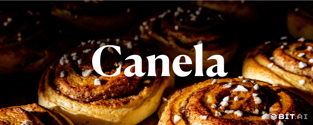
#3 Canela
Canela is elegance redefined. It mixes serif charm with sans-serif freshness, creating a luxurious but contemporary tone. Great for beauty brands, fashion campaigns, or high-end editorial designs, it’s a font that feels expensive, without ever feeling exclusive.
Professional Fonts for Website & Digital Content
In this day of clicks, scrolls, and swipes, your font needs to do more than look good, it needs to work well. These digital-savvy typefaces are crafted for the screen, with crisp legibility, generous spacing, and enough personality to make your content feel human. Whether you’re designing a sleek startup site or a content-rich blog, these fonts make your digital words not just readable, but memorable.
#1 Roboto Mono
Roboto Mono is a no-nonsense, code-savvy companion. With its monospaced structure, it’s built for developers and tech platforms that need clarity and alignment. But beyond function, it has just enough friendliness in its form to feel welcoming, even to non-coders.

#2 Manrope
Manrope is a little futuristic, a little funky, and entirely delightful. With open curves and balanced proportions, it’s a digital darling that works across mobile and desktop. It lends a slightly tech-forward feel, without losing its friendliness, great for modern startups and smart interfaces.

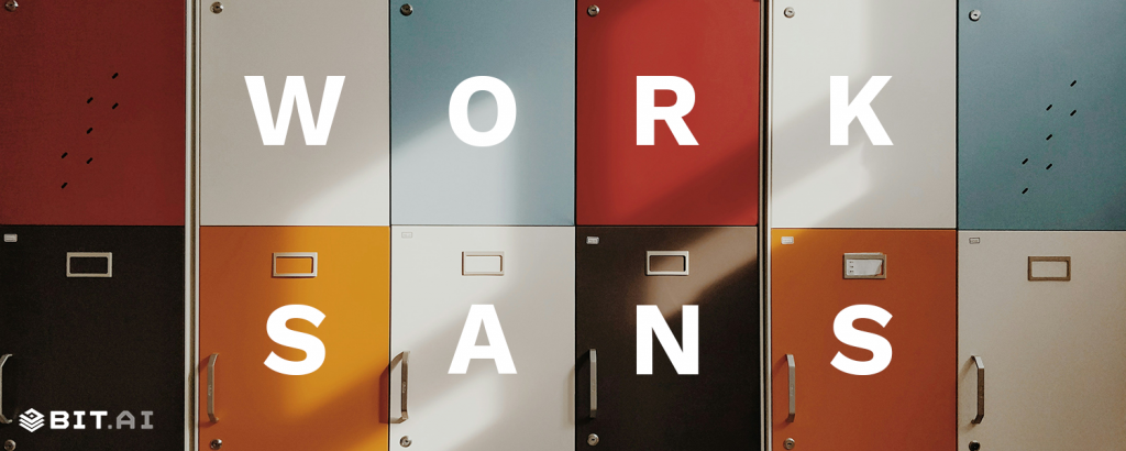
#3 Work Sans
Work Sans is the everyday hero of web design. Optimized for on-screen readability, it feels warm and contemporary without being flashy. Ideal for content-heavy sites where legibility is key, but style still matters, it’s like your favorite pair of sneakers: reliable, stylish, and always in use.
Improve Your Document Design with Bit.ai
A great typeface sets the foundation for a polished, professional document, but formatting, collaboration, and presentation matter just as much.
This is where Bit.ai, the smartest document collaboration platform comes in. Whether you’re crafting a business report, a sleek proposal, or an engaging presentation, Bit.ai ensures your work looks as professional as the best fonts you’ve carefully chosen.
Let’s explore how Bit.ai helps you create documents that are not only well-structured but also visually impactful!
1. Seamlessly Integrate Professional Fonts
No matter how good your content is, a poorly formatted document can instantly reduce its credibility. Bit.ai allows you to choose from a variety of serif fonts and sans serif fonts, ensuring your text is always crisp, professional, and aligned with your brand’s identity. Whether you prefer the timeless elegance of a serif font or the modern appeal of a sans serif font, Bit.ai makes it easy to customize your text while maintaining a clean and polished layout.
? Stuck on formatting? Bit.ai’s smart templates have got you covered—just customize and go!
2. Create Visually Stunning Documents Without Design Skills
Not everyone is a graphic designer, but that doesn’t mean your documents have to look plain or unstructured. Bit.ai provides pre-designed templates that incorporate the right balance of typography, spacing, and font size to ensure your content is aesthetically pleasing. Whether you’re working on a corporate report, a marketing proposal, or internal documentation, Bit.ai ensures a professional look without requiring advanced design knowledge.

3. Maintain Brand Consistency Across All Documents
When you want to look efficient, you need to be consistent. You can save your favorite typeface, font, and formatting style with Bit.ai and then use it in all of your company’s papers. This is especially helpful for companies that want to make sure that their branding, internal communications, and things they send to customers are all the same. Standardizing the use of serif and sans serif fonts is one way that Bit.ai helps build a polished and consistent visual character.
4. Enhance Collaboration with Real-Time Editing and Feedback
Bit’s real-time collaboration features make it easy for teams to work together, making changes, suggesting changes, and improving content without having to deal with multiple email attachments or version control problems. Bit.ai makes sure that everyone on your team can add effectively to any project, whether it’s a financial report, a sales pitch, or an executive presentation. The formatting stays the same!
5. Optimize Readability with Smart Formatting Options
Choosing the right font size and style for the body text can make or break how easy it is to read. Bit.ai has smart formatting choices that change the spacing, alignment, and structure of paragraphs automatically to make text easier to read. Bit.ai makes sure that your content is easy to read and looks good, no matter what font you use (serif for a printed report or sans serif for a digital display).
6. Share and Export Documents with Professional Appeal
What’s the point of crafting a beautifully designed document if it doesn’t look the same when shared? Bit.ai allows users to export their work in multiple formats (PDF, Word, etc.) while maintaining the integrity of their typeface and layout. Whether you’re sending a client proposal, an internal report, or an investor presentation, your document will retain its professional structure across different platforms and devices.
Making the Right Font Choice
The right design does more than just look good; it improves communication, makes sure that your writing is easy to read, and changes how people think about what you write. Choosing the right font is important for making a good impact, whether you’re writing a business report, improving your resume, making marketing materials, or making your website work better.
You can easily make your business materials look better if you know the differences between serif and sans serif fonts, pick the right font size for body text, and make sure everything looks the same on all platforms.
And if you’re looking for a tool that helps you seamlessly integrate the best fonts into beautifully formatted documents you should embrace Bit.ai– it’s the perfect tool to integrate the best fonts into your workflow! Adios ?
FAQs
Q1: What is the best font for business documents?
New Roman, Garamond, and Calibri are among the best fonts for professional documents.
Q2: What is the best font for resumes?
Helvetica, Georgia, and Arial ensure high readability and a polished look.
Q3: What font size should I use for body text?
For most documents, a font size of 10–12 point is ideal.
Q4: Should I use serif or sans serif fonts for websites?
Sans serif fonts like Roboto and Open Sans are recommended for digital content due to their readability on screens.
Q5: How do I choose the right typeface for my brand?
Consider your industry and the message you want to convey. Classic brands might opt for serif fonts, while modern companies prefer sans serif fonts like Montserrat.
By making intentional font choices, you ensure your documents leave a lasting impact!